
THE PROBLEM!
Users struggled to access trustworthy professionals and clearly verify credentials. Many found existing platforms too impersonal or time-consuming, lacking transparency, personalized communication, and a way to retain or revisit session insights for future use.
The Big Picture
In today’s fast-paced world, finding reliable, personalized advice shouldn’t be a hassle. But many users face confusing platforms, long wait times, and uncertainty around expert credibility.
NexPro was designed to change that.
This platform makes it easy to connect with verified professionals, book sessions quickly, and build trust through clear communication and transparency. The focus? A smoother, more confident user experience from start to finish.
Possible Problems
Lack of trust: Users hesitate to book sessions because they don’t trust the expert’s credibility.
Delayed communication: Users value prompt responses and are frustrated with delays from experts or platforms.
Booking friction: Users lose interest when the process feels too long or complicated.
Possible Solutions
After conducting research and speaking directly with users, it became clear what mattered most: trust, ease of use, and quick access to credible experts. These core values guided every design decision moving forward, ensuring the platform met real user needs and expectations.
Build Trust Visually
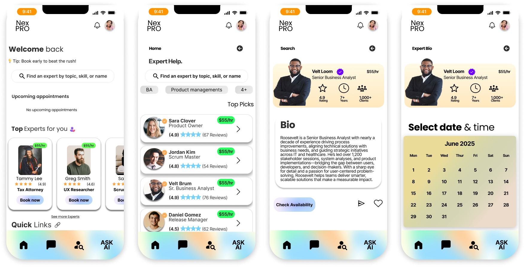
Expert profiles prominently display verified credentials — including degrees, certifications, and licenses — to reassure users of each expert’s credibility.Session History & Call Notes
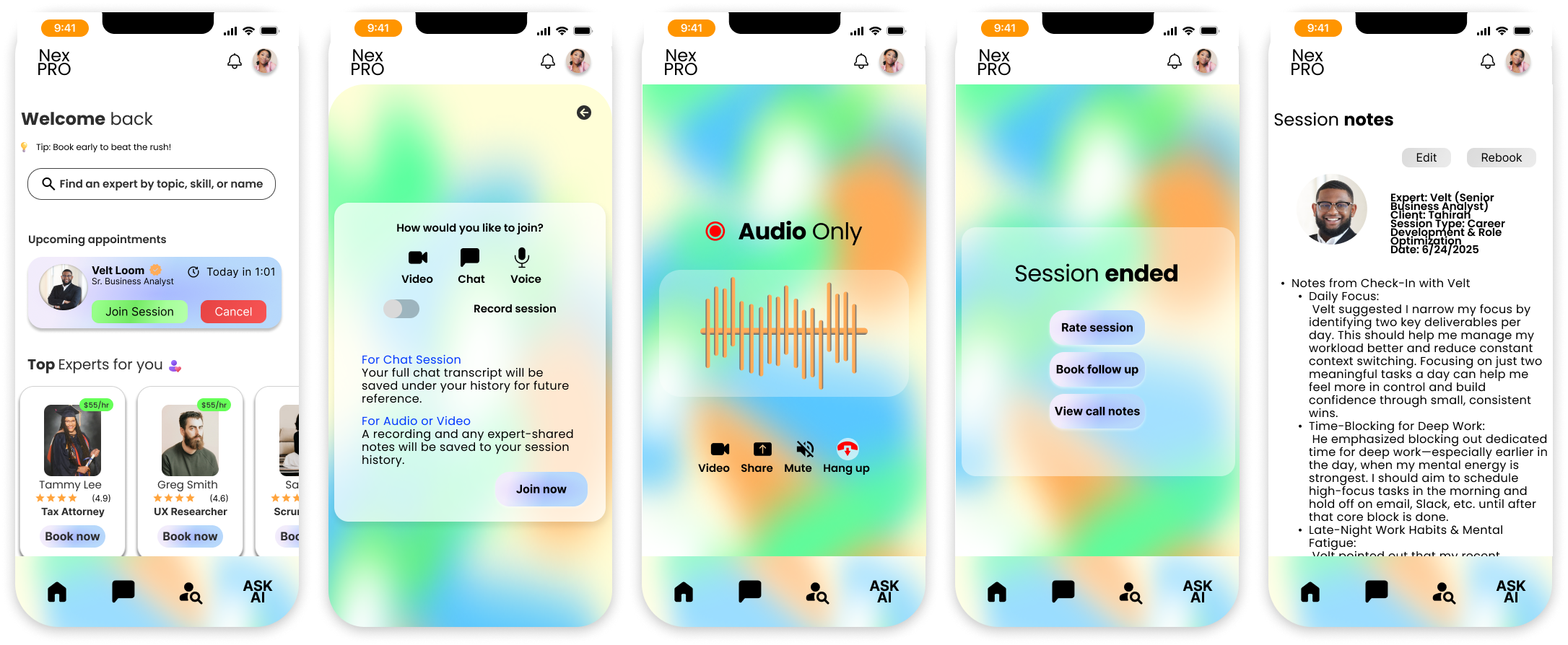
Users can revisit past sessions and view expert-submitted notes or summaries. This helps them remember key advice, track their progress, and build long-term trust with the platform.Streamlined Booking Flow
Originally designed as a one-step process, the booking flow was updated to a clearer two-step experience after usability testing. Users now choose a time first, then confirm and pay—reducing overwhelm and increasing task completion.
Real Talk with Real Users
To uncover real user needs, I interviewed participants aged 22–55 about how they seek expert advice. Some had used platforms like LinkedIn or MDLIVE, while others were new to the idea but curious.
I learned that users value flexible communication—chat for follow-up, calls for speed, and video for connection. But the biggest barrier? Trust. Without clear credentials or transparent pricing, most users said they wouldn’t feel confident booking.
People also expected a simple, intuitive experience with built-in scheduling and expert reviews. Common frustrations included vague pricing, long wait times, and overly automated systems.
These insights directly shaped my design—prioritizing transparency, usability, and real human connection.
Validating What Users Felt
After talking with users, I wanted to see if their frustrations showed up in other platforms, so I took a closer look at LinkedIn, MDLive, and Rocket Lawyer. Each one had its strengths, but they often fell short on what people actually wanted: clear credentials, flexible ways to connect, and a more personal touch.
Across the board, the experiences often felt generic. Users couldn’t always tell if an expert was truly qualified, how much it would cost, or if the advice would even be helpful.
It basically confirmed what I’d already heard people don’t just want access to experts. They want to feel confident in who they’re talking to. That realization shaped the direction of NexPro: building a platform centered on trust, transparency, and real human connection.
To dig deeper, I conducted a SWOT analysis of major platforms users mentioned or had experience with.
LinkedIn SWOT


MDLive SWOT
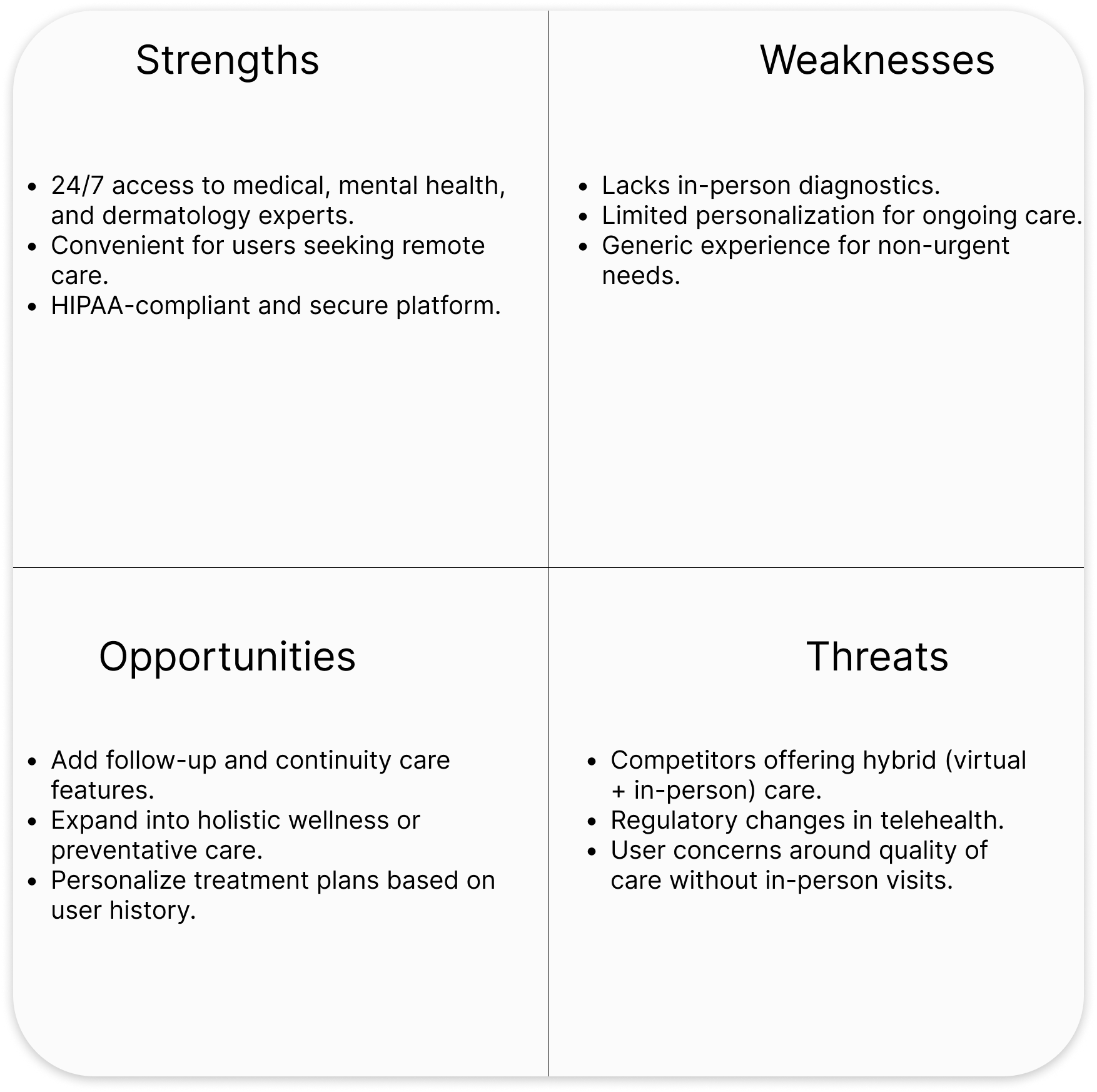

The Vison!!!!
Seeing these gaps across the board, I felt even more confident in NexPro’s mission: to connect people with experts they can trust—easily, clearly, and confidently.
RocketLawyer SWOT


Who We’re Designing For

After seeing where other platforms missed the mark, I wanted to bring those gaps to life through real scenarios. That’s where Kyng and Tammy come in.
Kyng, a driven business analyst, and Tammy, a practical professional seeking legal guidance, helped me visualize the real people NexPro needed to serve. Their stories revealed what mattered most—clarity, credibility, and control.
By stepping into their shoes, I uncovered not just their goals, but their pain points—what slowed them down, what made them skeptical, and what would keep them coming back.


Sketches to Structure
To bring NexPro to life, I began with Lo-fidelity hand-drawn sketches to explore layout ideas, task flows, and screen hierarchy. These early concepts helped clarify core interactions like booking, filtering experts, and using the calendar.
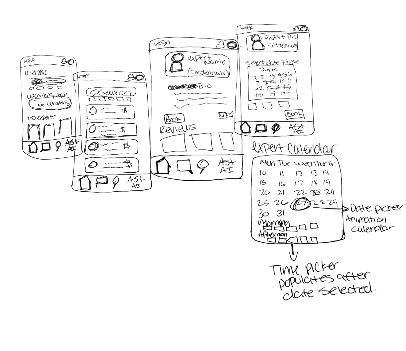


I then moved into mid-fidelity wireframes to validate navigation and reduce friction while keeping user goals and clarity at the center of each screen.

Putting It to the Test
After completing wireframes, I conducted usability testing to validate core interactions and uncover pain points in the user journey.
To evaluate the usability and overall experience of NexPro, I ran moderated testing sessions with 5 participants. Each participant was asked to complete key tasks such as searching for an expert, booking a session, and reviewing past advice.

Goals
Identify friction in the booking flow
Test comprehension of navigation and layout
Measure user confidence in selecting experts and communication tools
What I Learned
The original 1-step booking flow caused confusion due to information overload
Users preferred the new 2-step booking process, which increased clarity and task completion
Participants valued seeing expert credentials, reviews, and rates up front
Small UI enhancements, like clearer feedback after actions, helped build trust and ease
These findings directly influenced my redesign decisions, ensuring NexPro felt more intuitive, human-centered, and transparent across the board.
Designing with Emotion

Building a Design Language That Speaks Trust
To bring NexPro to life, I created a flexible and emotionally driven design system rooted in trust, clarity, and connection. I used Plutchik’s Theory of Emotion to guide the visual palette, incorporating green for trust (66FF58), yellow for joy (FCFF52), and orange for anticipation (FFAC58). These colors blend into a soft gradient that gives the interface warmth and personality.
Typography stays modern and readable using Poppins for headings and Inter for body text. This combination balances authority with approachability.
The UI kit includes easy-to-use buttons, clear icons, and helpful labels that look and work the same across all screens. Each element was designed to make the app feel simple, familiar, and easy to navigate.
The result is a cohesive system that supports user confidence and makes expert guidance feel human and approachable.
Color System & Emotional Intent
Out with the Old. In with the NEW!
In the early stages, I experimented with a pre-made green gradient as my primary palette. However, it reminded me too much of platforms like Credit Karma, lacking the unique personality I wanted NexPro to express.
To craft a more intentional system, I turned to Plutchik’s Theory of Emotion to inform my color choices:
#66FF58 (Bright Green) — Represents trust, which is the core value of NexPro.
#FCFF52 (Yellow) — Symbolizes joy, creating a sense of optimism and relief when users connect with a credible expert.
#FFAC58 (Orange) — Tied to anticipation and interest, motivating users to take the next step with confidence.
Instead of choosing one dominant color, I created a custom mesh gradient from scratch, blending all three shades into a vibrant, emotionally charged background. This approach allows NexPro to visually communicate its purpose—trustworthy, encouraging, and human-centered.
WCAG
While I didn’t formally test my mesh gradient for full WCAG compliance, I used high-contrast text and verified readability across the most common areas of the background. Accessibility is something I’d continue refining in future iterations.

The Experience, Refined
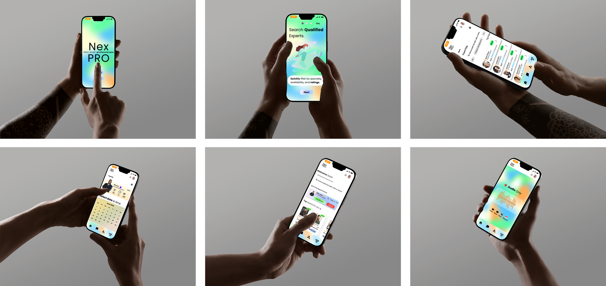
With the foundation in place, I brought NexPro to life through high fidelity screens that reflect the emotional goals of the platform. Every interaction is designed to feel intuitive, warm, and reassuring from onboarding to booking and beyond. These visuals show how usability, trust, and human connection come together in the final product.
Seeing it all come to life reminded me why I love designing for people. When it works, it feels like magic.
Search&Booking

Join Audio session &Review notes
Ask Ai

Looking back to see how far i’ve come.
If I could bring NexPro to life today, I would, not just because it solves a real problem, but because working on it was genuinely rewarding. Every part of the process, from user interviews to rethinking the booking flow—pushed me to think deeper, ask better questions, and stay flexible when things didn’t go as planned.
What stood out most was how small changes made a big impact. Something as simple as splitting the booking into two steps or adjusting the search bar layout completely changed how confident users felt. Hearing feedback like “Oh, I get it now” was when I knew I was moving in the right direction.
This project really reminded me that great design doesn’t arrive fully formed. It’s built through trial, feedback, mistakes, and the willingness to start fresh when needed. NexPro became more than just a case study—it became proof of what happens when you center the process around real people.
I came out of this project more confident in my skills, but even more excited to keep learning and improving. Because honestly? The work is never really done—and that’s what makes it so exciting.
Looking ahead, I’d love to continue building out NexPro as a desktop experience—thinking through how the layout, interactions, and visual hierarchy can scale up for professionals who prefer to work on larger screens. It’s another opportunity to meet users where they are and make the platform even more accessible.
But anyways :)……..
Thank you for taking the time to explore my NexPro case study.

This project challenged me to think critically, design with empathy, and iterate with purpose. I’m proud of the journey and excited to bring the same energy and thoughtfulness to future design challenges.