

The Dining Dilemma.
Splitting a bill with friends should be simple, but for many, it turns into a frustrating, time-consuming experience. Whether it’s manually calculating who owes what, dealing with forgotten payments, or awkwardly reminding friends to pay their share, current payment apps like Venmo, Cash App, and Apple Pay fall short when it comes to transparent and fair itemized splitting.
Check Please is a bill-splitting solution designed to eliminate that frustration. By allowing users to upload receipts, assign items to individuals, and handle payments within a few intuitive steps, Check Please aims to bring ease and clarity to group dining scenarios. This case study explores the design process behind creating a seamless, user-friendly experience that caters to both those who value precision and those who just want to pay and move on.
Given a one-week design sprint, my goal was to identify the key pain points users face when splitting bills and develop a streamlined solution through rapid research, prototyping, and user feedback.
The Goal!
The goal of Check Please is to design a streamlined, intuitive bill-splitting experience that allows users to:
Upload a receipt or scan a QR code quickly.
Assign individual items to each person at the table.
Automatically calculate tax and tip fairly.
Complete payments and send reminders effortlessly.
Provide a clear breakdown of who has paid and who hasn’t.
This project focuses on creating a solution that feels effortless for both the detail-oriented users who care about fairness and the casual users who just want a fast, no-hassle way to pay their share.

The Problem!
When dining out or sharing expenses, splitting the bill often becomes a messy and awkward process. Existing payment apps like Venmo, Cash App, and Apple Pay offer basic “split by total” features but fail to address the complexities of item-level splitting, calculating tax and tip fairly, and managing group payments in real time. Users are left relying on manual math, back-and-forth messaging, or overpaying to avoid confrontation. This lack of precision and transparency creates frustration and inefficiency in what should be a simple task.

What We Heard at the Table!
To understand how people truly feel about splitting the bill, I sat down with a group of social diners—friends, roomies, and casual foodies who deal with this headache often. Through casual conversations and direct interviews, I uncovered the recurring frustrations, awkward moments, and “there has to be a better way” comments that shape this experience.
Why Current Apps Fall Short:
SWOT Analysis from User Interviews
After conducting several user interviews, I analyzed the apps most participants currently use for splitting bills which include Cash App Venmo and Apple Pay. While these apps are popular for peer to peer payments, user feedback revealed critical gaps in their bill splitting experiences. These insights informed the following SWOT analysis.


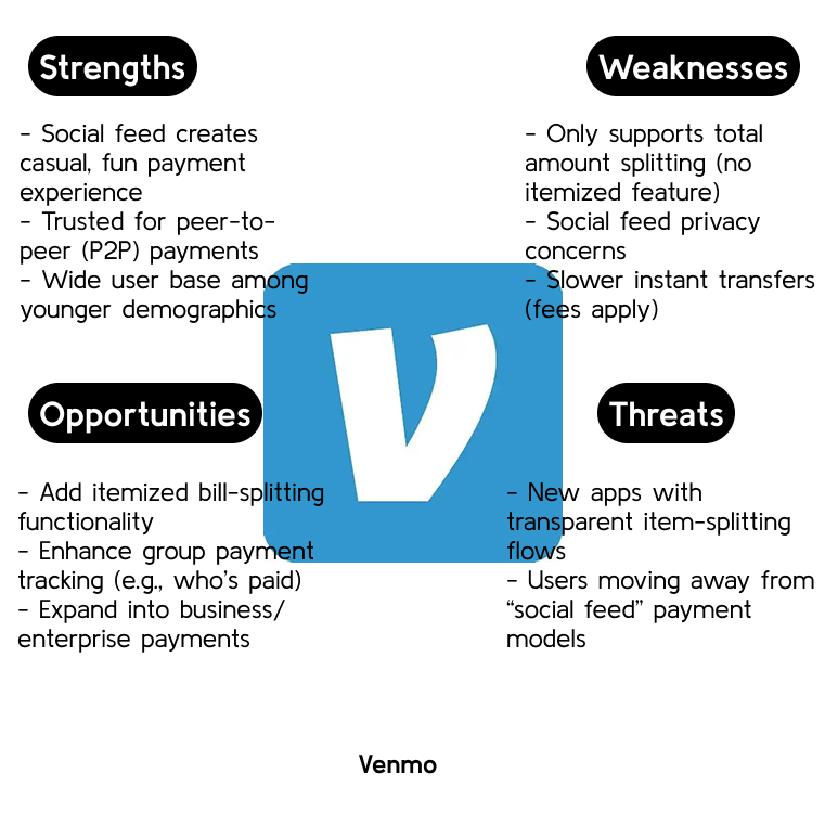

Key Insights for Check Please:
None of them currently support itemized, fair splitting at the UX level.
Venmo’s social feed makes it fun but lacks transparency.
Apple Pay’s strength is its convenience, but it’s not optimized for group payments.
All platforms leave room for a receipt scanning, item-splitting solution like Check Please to fill that gap.
Meet the People Behind the Problem!
To design an effective bill-splitting experience, it was important to understand the real people who face these frustrations every day. Through user interviews, I identified two key personas that represent the primary mindsets when it comes to handling group payments. These personas highlight the contrasting needs of users who prioritize fairness and precision versus those who value speed and convenience. By designing with both in mind, Check Please aims to deliver a solution that feels effortless for everyone at the table.


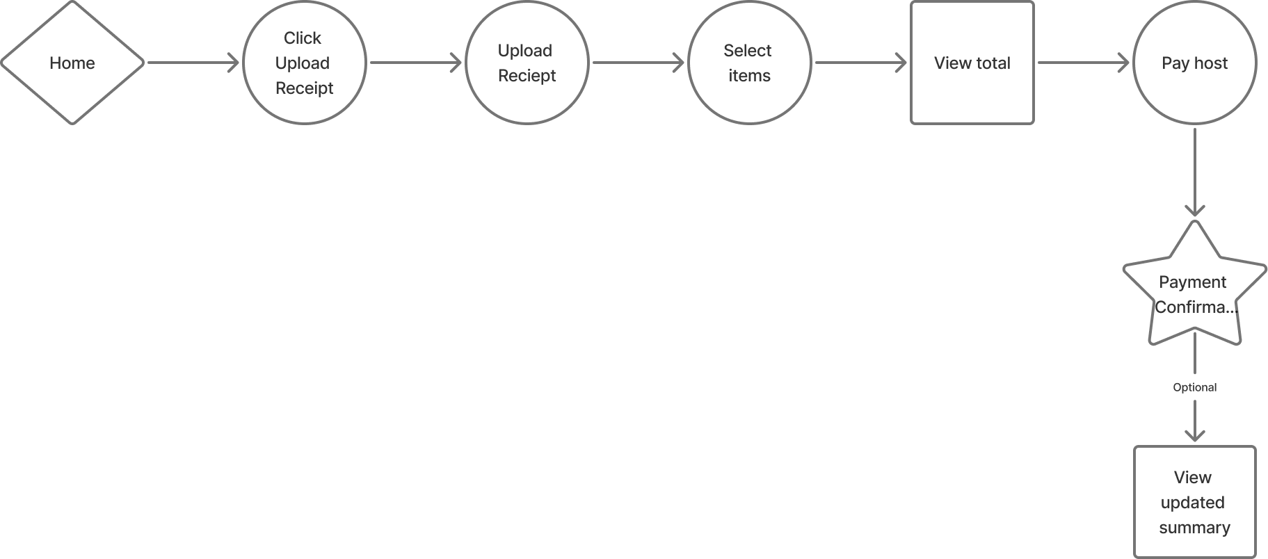
Streamlining the Split: The Check Please Flow
With a clear understanding of my users’ needs and frustrations, I focused on mapping out the ideal User Flow for Check Please. The goal was to ensure that both types of users, those who want to split fairly like Maya and those who prefer quick hassle-free payments like Jordan, could complete their tasks efficiently without friction.
Rather than overwhelming users with complex navigation or unnecessary steps, I designed a streamlined flow that guides them through uploading a bill, assigning items, and completing payment in just a few intuitive screens.
Bringing the Flow to Life!
With the user flow mapped out, I translated each step into clean, intuitive UI screens that focus on simplicity and clarity. The design language emphasizes ease of use while maintaining a visual hierarchy that guides users effortlessly through the bill-splitting process.
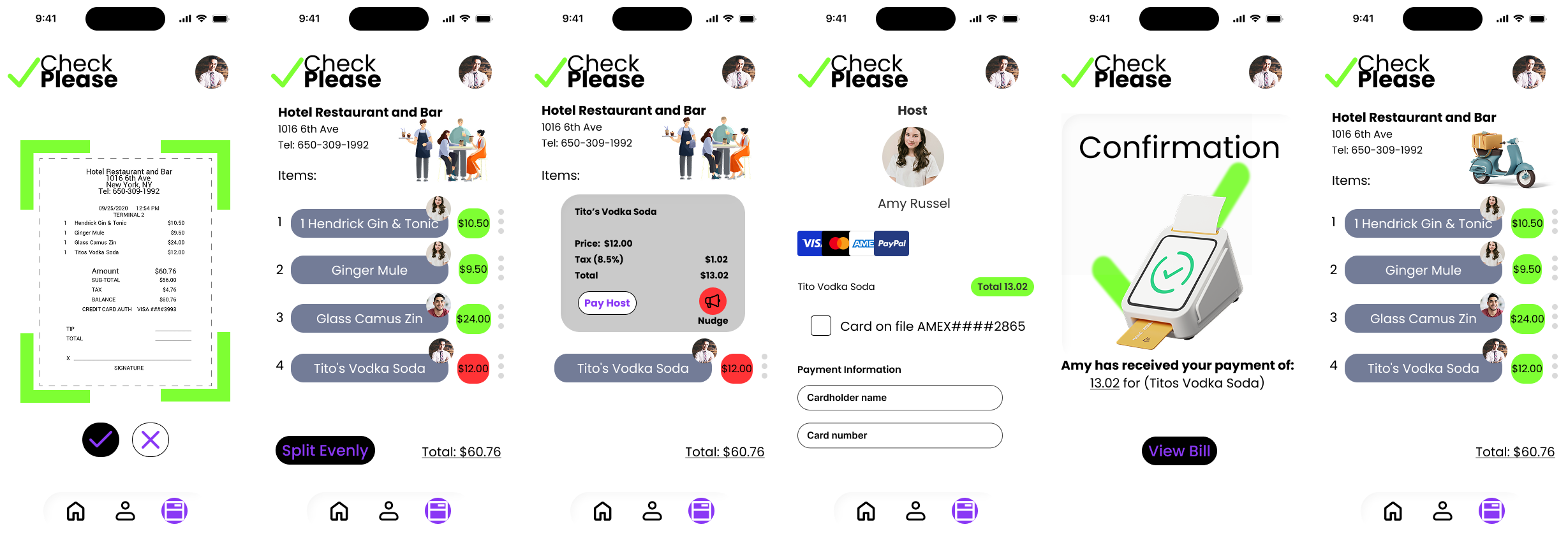
Upload Receipt Screen
Users are presented with a straightforward interface to either upload a photo of their receipt or scan a QR code. The minimal layout ensures users can quickly start the splitting process without confusion.
View Bill & Assign Items
Once the receipt is scanned, items are displayed in an organized list format. Users can either split evenly or assign individual items to specific friends using profile indicators, making it easy to track who’s responsible for what.Item Detail & Nudge Screen
For individual item payments, users can view a detailed breakdown of price, tax, and total. A “Pay Host” button allows for immediate payment, while the “Nudge” feature gently reminds others to settle their share.Payment Screen
Payment options are displayed clearly, allowing users to pay with saved cards or enter new payment information. The design streamlines this step to minimize friction, ensuring a smooth payment process.Confirmation Screen
Once payment is complete, users receive a clear visual confirmation, reinforcing trust and transparency in the transaction. A CTA button allows users to revisit the bill if needed.Bill Recap Screen
For hosts or group organizers, a summary screen shows a real-time view of who has paid, helping manage group payments effortlessly.
Usability Testing
With the last days of the project approaching, I conducted a quick usability test with 3 participants to validate the core task flow and ensure the design was intuitive. The primary tasks focused on:
Uploading a receipt or scanning a QR code.
Viewing which users have not paid their share and completing a payment on their behalf.
Completing a payment and viewing the confirmation screen.
The goal of this usability test was to observe how easily participants could navigate through the flow without assistance, and to identify any points of friction before finalizing the prototype.

Validating Design Choices with A/B Testing
Before finalizing the UI designs, I conducted a short A/B test to gather user feedback on two home screen variations. Participants were asked to select their preferred design and explain their reasoning. The goal was to determine which layout felt more visually appealing and intuitive to the user.
The results showed that Design B was preferred, with feedback highlighting its clean, simple layout, calming color scheme, and clearer visual hierarchy. Users appreciated that the design didn’t overwhelm them with large “PAY” text and found the interface self-explanatory, making it easier to navigate.
The insights reinforced key design principles, simplicity, visual clarity, and intuitive guidance resonate with users. These findings were instrumental in refining the final UI direction to ensure the design not only looked appealing but also enhanced usability.

VS

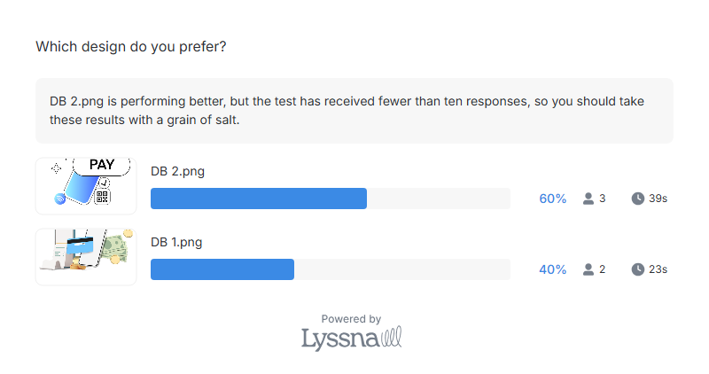
Note: This A/B test was conducted over the course of a one-week design sprint with a small group of 5 participants. While limited in scale, the feedback surfaced clear patterns around visual simplicity, ease of use, and overall aesthetic appeal. These rapid insights were critical in making informed design decisions within the tight project timeline.
Key Takeaways: Splitting Bills Shouldn’t Split Hairs
This project validated a simple truth that users want bill splitting to be fair, fast, and fuss free. Through user interviews, A/B testing, and usability sessions, it became clear that clarity in design, minimal steps, and transparent item-level assignment are essential to solving the frustrations users face with current payment apps. By focusing on intuitive flows and lightweight visual cues, Check Please delivers a streamlined experience that caters to both the detail-oriented Fair Splitters and the convenience-driven Quick Payers.
While the testing was conducted within a tight timeline, the feedback gathered was instrumental in refining the design and ensuring that every interaction supports ease and confidence at the table.


Next Steps: Beyond the Check, Building for the Future!
Given the short timeframe of this case study, my primary focus was to validate the core user flow and ensure a seamless bill splitting experience through quick interviews, A/B testing, and usability feedback. While the design solves key pain points around itemized splitting and payment tracking, there are several opportunities to expand Check Please further.
Future iterations could explore integrating group tabs for ongoing shared expenses, enhancing payment reminders with personalized messages, and developing partnerships with restaurants for QR code-based smart receipts. Additional usability testing with a larger and more diverse user base will help refine edge cases and introduce features that adapt to different group dynamics.
This case study provided a strong foundation, but Check Please has the potential to evolve into a comprehensive tool that redefines how people handle shared expenses with ease and transparency.